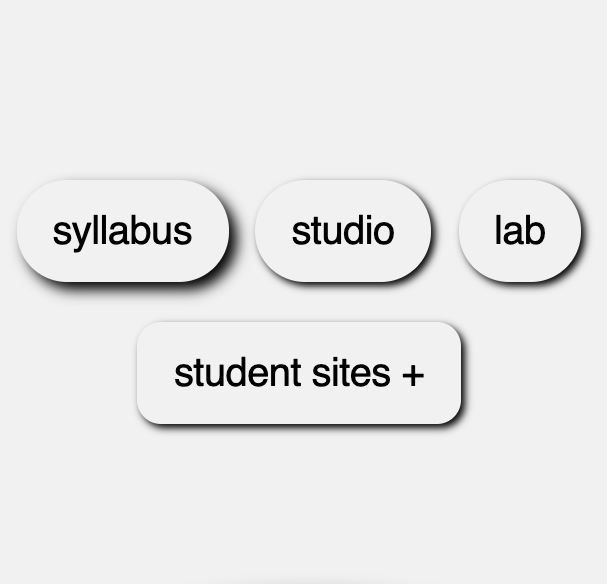
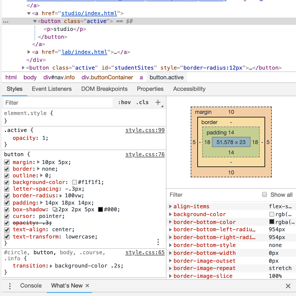
Box-shadow is a CSS Property that adds shadow effects around an element's frame.
attaches one or more shadows to an element.
Multipule effects can be seperated by commas.
Described by X and Y offsets relative to the element.
Allows you to cast drop shadows of the frame of almost any element.
Takes the shape of border-radius if it is specified on the element with box-shadow.
The z-ordering of multiple box shadows is the same as multiple text shadows (the first specified shadow is on top).
box-shadow:h-offset v-offset blur spread color inset;
h-offset - Required. The horizontal offset of the shadow. A positive value puts the shadow on the right side of the box, a negative value puts the shadow on the left side of the box
v-offset - Required. The vertical offset of the shadow. A positive value puts the shadow below the box, a negative value puts the shadow above the box .
blur - Optional. The blur radius. The higher the number, the more blurred the shadow.
spread - Optional. The spread radius. A positive value increases the size of the shadow, a negative value decreases the size of the shadow.
color - Optional. The color of the shadow. The default value is the text color.
inset - Optional. Changes the shadow from an outer shadow (outset) to an inner shadow
box-shadow:h-offset v-offset blur spread color inset;